Bridging the gap between uncertainty and the stock market
In the pursuit of success, the journey from theoretical research to tangible solutions is often fraught with challenges.

Written by
Stock Region
Articles
Jun 12, 2025
4 min read

Stock charts help visualize a stock's price movements, trends, and trading activity. They simplify complex data into easy-to-read graphs, making them essential for spotting opportunities and timing trades. Here's a quick breakdown:
Why learn stock charts?
They help identify trends, reversals, and optimal entry/exit points while cutting through market noise.
Example: Apple (AAPL) closed at $190.69 in July 2023, up 0.08% - a small move visible on a chart.
Key chart types:
Line Chart: Simple, shows trends but lacks detail.
Bar Chart: Displays open, high, low, close (OHLC) data but can look cluttered.
Candlestick Chart: Visualizes OHLC with color-coded candles, great for spotting patterns.
Core elements on charts:
Price: Open, high, low, close values.
Volume: Tracks shares traded - high volume confirms trends.
Time: Dates along the horizontal axis, from intraday to yearly views.
Advanced tools:
Moving averages (e.g., 50-day, 200-day) help identify trends.
Indicators like RSI and MACD provide insights into momentum and overbought/oversold conditions.
Patterns to watch:
Bullish: Hammer, Morning Star.
Bearish: Hanging Man, Bearish Engulfing.
Indecision: Doji.
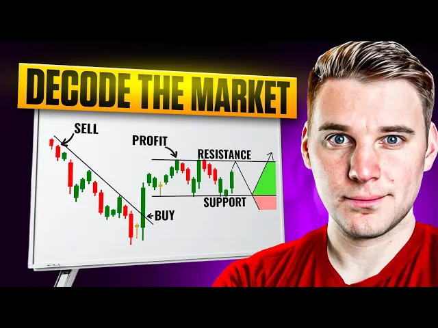
Support & resistance:
Price levels where buying or selling pressure emerges, often aligning with moving averages.
Quick Comparison of Chart Types
Chart Type | Strengths | Weaknesses | Best Use Cases |
|---|---|---|---|
Line Chart | Simple, shows trends | Lacks detailed price action | Long-term trend analysis |
Bar Chart | Detailed (OHLC data) | Can appear cluttered in volatility | Intraday or medium-term trading |
Candlestick Chart | Clear patterns, market sentiment | Complex for beginners | Short-term trading, patterns |
Mastering stock charts helps you make informed decisions and manage risks effectively. Use this guide as a starting point to sharpen your trading skills.
How to Read Stock Charts like Market Wizards - Technical Analysis 101
Basic Parts of Stock Charts
Understanding the core elements of stock charts is essential for making informed trading decisions.
Types of Stock Charts
Stock charts come in three main formats, each catering to different trading needs.
Line charts: These connect closing prices over time with a single continuous line. While they’re great for spotting long-term trends, they don’t show details like opening prices, daily highs, or lows.
Bar charts: These charts provide a more detailed view by showing the open, high, low, and close (OHLC) for each trading period. Vertical bars depict the price range, with small horizontal lines marking the opening (left) and closing (right) prices. Though informative, they can feel cluttered during volatile markets.
Candlestick charts: Known for their visual clarity, these charts also display OHLC data. The color-coded candles - green or white for upward movement and red or black for downward - make it easy to gauge market sentiment. Originating in Japan during the 18th century, candlestick charts are a favorite among traders for recognizing patterns quickly.
Chart Type | Strengths | Weaknesses | Best Use Cases |
|---|---|---|---|
Line Chart | Simple, highlights long-term trends | Lacks detailed price action | Long-term trend analysis |
Bar Chart | Displays OHLC data, balanced detail and clarity | Can appear cluttered in volatile markets | Intraday analysis, medium- to long-term trading |
Candlestick Chart | Visualizes market sentiment, ideal for patterns | Complex for beginners | Short-term trading, sentiment insights |
Now, let’s break down the key data points that form the backbone of any stock chart.
Core Data Points
Stock charts revolve around three fundamental elements: price, volume, and time.
Price includes the open, high, low, and close values, which collectively provide a snapshot of daily price activity.
Volume shows the total number of shares traded during a specific period, typically displayed as bars at the chart’s bottom. High trading volume often confirms price movements, while low volume can indicate weak momentum. For example, in early February 2023, the SPDR S&P 500 ETF (SPY) saw high trading volume that established key support and resistance levels, influencing price trends through May.
Time forms the horizontal axis, typically showing dates in the MM/DD/YYYY format used in U.S. markets. Timeframes can range from one-minute intervals for day traders to monthly views for long-term investors, depending on your strategy.
Another important metric is the 52-week high and low, which highlights a stock’s trading range over the past year. These levels often act as psychological barriers - stocks nearing their 52-week high may face selling pressure, while those near their lows may attract value-driven investors.
Beyond these basics, additional metrics help refine your analysis.
Other Metrics on U.S. Stock Charts
Most U.S. trading platforms include extra data points alongside charts to provide deeper insights.
Market capitalization: This measures a company’s size by multiplying the stock price by the number of outstanding shares. Companies are typically categorized as large-cap (over $10 billion), mid-cap ($2–10 billion), or small-cap (under $2 billion).
Price-to-earnings (P/E) ratio: This ratio compares a stock’s price to its earnings per share, helping assess whether it’s overvalued or undervalued. For instance, a P/E of 15 means investors pay $15 for every $1 of annual earnings.
Dividend yield: This metric expresses annual dividends as a percentage of the current stock price. For example, a $100 stock with a $4 annual dividend has a 4% yield, making it useful for income-focused investors.
Moving averages: These smooth out price fluctuations to highlight trends. The 50-day and 200-day moving averages are especially popular. A "golden cross", where the 50-day moving average rises above the 200-day, often signals bullish momentum. Between 1990 and 2009, this strategy yielded an average annual return of 5.4% for S&P 500 stocks.
For more advanced analysis, traders often rely on technical indicators like the Relative Strength Index (RSI) and Moving Average Convergence Divergence (MACD).
RSI: This measures whether a stock is overbought or oversold. Readings below 30 indicate oversold conditions 75% of the time, while readings above 70 suggest overbought conditions with 72% accuracy.
MACD: This tracks trend strength and has proven effective in backtests, delivering profitable signals 62% of the time for S&P 500 stocks between 2000 and 2020.
These tools and metrics can guide your decisions on when to enter or exit trades, making them invaluable for traders at any level.
Reading Chart Patterns and Indicators
Now that you’ve got a handle on the basics, it’s time to dig deeper into the art of reading patterns and signals. Chart patterns and technical indicators work hand in hand to shed light on market sentiment and potential price shifts, helping you make more informed trading decisions. Let’s take a closer look at some essential chart patterns and indicators that can sharpen your market analysis.
Candlestick Patterns
Candlestick patterns are like visual storytellers of market sentiment. Steve Nison, a pioneer in candlestick charting, highlights their effectiveness in understanding the battle between buyers and sellers. These patterns can indicate whether prices are likely to reverse or continue their current trend.
Bullish patterns suggest upward momentum and often appear at market lows or during pullbacks in an uptrend. For example:
The Hammer forms when a stock opens high, drops significantly, but rebounds to close near its opening price. This creates a small body with a long lower shadow, signaling strong buyer support.
The Bullish Engulfing pattern occurs when a large green candlestick completely engulfs the previous red one, signaling a potential reversal. A notable example is Bitcoin’s Three Outside Up pattern in 2024, which began with a small bearish candle, followed by a large bullish one, and a third bullish candle that confirmed the trend shift.
Bearish patterns signal potential downward movement. For instance:
The Hanging Man, which resembles the Hammer, appears at the top of uptrends and warns of selling pressure.
The Bearish Engulfing pattern, where a large red candlestick engulfs the previous green one, indicates that sellers are gaining control.
Here’s a quick reference for common patterns:
Bullish Patterns | Bearish Patterns |
|---|---|
Hammer | Bearish Pin Bar |
Bullish Engulfing | Evening Star |
Morning Star | Bearish Engulfing |
Three White Soldiers | Three Black Crows |
Bullish Harami | Dark Cloud Cover |
Indecision patterns, like the Doji, show market uncertainty. A Doji forms when the opening and closing prices are nearly the same, creating a cross-like shape that signals neither buyers nor sellers have control.
To get the most out of candlestick patterns, always confirm them with other technical tools. Use them to set clear entry and exit points, and don’t forget to place stop-loss orders to manage risk. These patterns are generally more reliable on higher timeframes, such as 1-hour, 4-hour, or daily charts.
Trendlines and Price Trends
Trendlines offer a broader perspective on market direction. By connecting two or more price points, they help identify whether a stock is in an uptrend, downtrend, or moving sideways.
Uptrend lines connect higher lows, acting as support where prices often bounce upward.
Downtrend lines connect lower highs, serving as resistance where prices tend to reverse downward.
A valid trendline requires at least three points of contact. While two points are enough to draw the line, the third confirms its reliability. When drawing trendlines, avoid making them too steep - they’re more likely to break. Also, ensure the connected highs or lows are spaced appropriately. For long-term analysis or stocks with significant price changes, a semi-log scale may provide better accuracy.
A trendline break can signal a potential trend reversal, but it’s not a standalone indicator.
"Trend line breaks should not be the final arbiter, but should serve merely as a warning that a change in trend may be imminent".
Always cross-check with volume, candlestick patterns, or other indicators before acting. Internal trendlines, which connect the majority of price points while ignoring outliers, can help reduce noise and provide a clearer picture.
Support, Resistance, and Moving Averages
Support and resistance levels are psychological price zones where buying or selling pressure typically emerges. Support is where demand prevents further price drops, while resistance is where selling pressure caps further advances.
Adding moving averages to your analysis introduces a dynamic element to these levels. The 50-day and 200-day moving averages are particularly popular for identifying trends and often act as support or resistance themselves. For example:
In an uptrend, moving averages often serve as support, with prices bouncing higher when they touch these levels.
In a downtrend, they act as resistance, limiting upward movements.
Legendary trader Marty Schwartz highlights the importance of moving averages:
"The 10 day exponential moving average (EMA) is my favorite indicator to determine the major trend. I call this 'red light, green light' because it is imperative in trading to remain on the correct side of a moving average to give yourself the best probability of success. When you are trading above the 10 day, you have the green light, the market is in positive mode and you should be thinking buy. Conversely, trading below the average is a red light. The market is in a negative mode and you should be thinking sell".
Confluence zones occur when moving averages align with horizontal support or resistance levels. These zones often provide stronger signals due to the overlap of multiple factors. When prices approach these areas, watch for increased volume and confirm with candlestick patterns to anticipate potential reversals.
Keep in mind that longer-term moving averages, like the 200-day, tend to offer more reliable signals than shorter-term ones. However, moving averages are lagging indicators - they confirm trends rather than predict them.
If you’re buying a bounce off a moving average, consider placing your stop-loss a few points below the 50-day or 200-day level. This gives your trade some breathing room while managing risk. Combining moving averages with other tools, like RSI or MACD, can help reduce false signals and improve your timing. Just be cautious in sideways markets, where moving averages are less effective due to the lack of a clear trend.
Using Stock Region Tools for Chart Analysis

Stock Region offers tools designed to transform your chart-reading skills into actionable trading decisions. By blending advanced analysis with practical advice, the platform helps U.S. traders maximize their technical analysis efforts. Let’s dive into how Stock Region simplifies the process with its specialized tools.
Stock and Option Signals
Stock Region builds on chart analysis techniques by providing real-time trading signals that eliminate the need for constant chart monitoring. Instead of manually scanning for patterns, you receive alerts when high-probability setups arise in the market.
"Trading signals are essentially recommendations or alerts generated by sophisticated algorithms, technical indicators, or seasoned analysts." - ActionForex.com
These signals rely on the statistical success rates of well-established patterns. For example, when the platform detects a bearish engulfing pattern, it indicates a setup with about a 72% success rate for predicting bearish reversals. Similarly, a three outside up pattern offers a 70% success rate for forecasting upward moves.
If you’re alerted to a morning star pattern (with a 65% success rate), you can see exactly how the three-candle formation developed and why it signals a potential reversal.
"Trading signals can be a valuable asset for traders of all levels, offering enhanced decision-making, time efficiency, and access to expert knowledge." - ActionForex.com
This time-saving approach is especially beneficial for busy traders. Instead of combing through countless charts, you can focus on refining your risk management and execution strategies while Stock Region handles the heavy lifting of pattern recognition.
Market Briefings and Reports
Stock Region’s daily market briefings turn raw chart data into actionable insights by explaining the why behind price movements. These reports don’t just outline what happened - they provide the context needed to understand whether a chart pattern is likely to play out.
For instance, on June 3, 2025, Stock Region highlighted IonQ at $39.81 and Lumentum’s rise to $77.65, explaining that acquisitions and updated EPS guidance were driving the moves. When you spot bullish patterns in these stocks, this context helps you connect the dots between technical signals and fundamental catalysts.
The briefings also include economic data and broader market trends, which are crucial when analyzing support and resistance levels. Knowing whether the overall market is leaning bullish or bearish can significantly influence your trading decisions.
Coaching and Community Support
Stock Region goes beyond charts and data by offering expert guidance to sharpen your skills. Through coaching and community support, the platform bridges the gap between theory and practice, making technical concepts easier to apply.
With personalized coaching and virtual consultations, you can discuss chart setups directly with experienced traders. In real-time trading meetings, seasoned professionals demonstrate how to interpret trendline breaks, volume shifts, and other critical signals. This hands-on interaction provides insights that books or tutorials often miss.
"The stocks featured in this report were previously delivered in our trading room in real-time. To access Stock Region's real-time trade ideas, then be sure to purchase a membership now." - Stock Region
The platform’s trading room lets you see how experienced traders combine candlestick patterns, moving averages, and volume indicators to time their trades. Watching this process in action helps build the confidence to apply your analysis effectively.
Stock Region’s community of investors also offers a collaborative learning environment. You can share your chart setups, receive feedback, and learn from others’ experiences, avoiding common mistakes and accelerating your progress.
For those seeking structured learning, the platform’s mentorship programs connect you with seasoned traders who explain how specific patterns work in different market conditions. They also guide you on adapting your analysis as market dynamics evolve.
If you’re new to trading, Stock Region’s courses provide hands-on training with real market examples. These lessons reinforce the fundamentals of chart reading, helping you develop the pattern recognition skills that set successful traders apart from those stuck in analysis paralysis.
Pros and Cons of Stock Chart Analysis
Stock chart analysis offers valuable insights into market trends but comes with its own set of challenges. Knowing the benefits and limitations can help you decide how to use technical analysis in your trading strategy.
Benefits and Drawbacks of Chart Analysis
Chart analysis provides a visual snapshot of market behavior, making it easier to spot patterns and trends. However, it’s not without its downsides. Here’s a comparison of the main advantages and disadvantages:
Advantages | Disadvantages |
|---|---|
Visual clarity: Charts make price movements easier to understand by offering a clear representation of trends over time. | Subjective interpretation: Different traders may interpret the same chart patterns in completely different ways, leading to inconsistent conclusions. |
Real-time insights: Identifies key support and resistance levels, helping traders understand market dynamics. | Historical focus: Relies heavily on past data and often ignores fundamental factors that could impact prices. |
Market psychology: Highlights the actions of major investors, revealing when stocks are being heavily bought or sold. | False signals: Can mislead traders, especially in volatile markets or during unpredictable events. |
Risk management: Helps assess volatility patterns, which is crucial for managing risk effectively. | Short-term bias: Works best for short-term trading and is less effective for long-term investment strategies. |
Timing precision: Pinpoints optimal entry and exit points based on historical data and technical indicators. | Mixed signals: Different indicators often provide conflicting information, adding complexity. |
Accessibility: A straightforward tool that doesn’t require advanced financial knowledge. | Algorithmic interference: Automated trading systems can disrupt traditional technical signals. |
The influence of institutional investors, who account for 80% of all trading activity, adds another layer of complexity. Their actions often shape chart patterns, reflecting the strategies of seasoned market participants.
"Stock prices reflect the collective beliefs of investors about a company's ability to make profits in the future."
– Han-Sheng Chen, associate professor of finance at Lipscomb University's College of Business
That said, technical analysis has its limitations. It often oversimplifies markets by focusing solely on price and volume, ignoring other critical factors. Additionally, the assumption that past patterns will repeat can be problematic, as markets evolve and past performance doesn’t guarantee future outcomes.
When to Use Chart Analysis
Understanding these pros and cons helps traders decide when to rely on chart analysis. It’s particularly effective for short-term trading strategies like day trading and swing trading, where the focus is on price momentum and market psychology rather than company fundamentals. Patterns like breakouts and trend reversals often provide actionable insights in these scenarios.
In volatile markets, chart analysis becomes even more relevant. Large price swings make support and resistance levels easier to spot, and breakout patterns often carry more weight. However, volatility can also increase the likelihood of false signals, so risk management remains crucial.
For long-term investors, chart analysis can complement fundamental analysis. For example, investors might use financial metrics to select a stock but rely on technical indicators to time their entry - buying near a support level or after a breakout above resistance. In sideways, range-bound markets, technical indicators are often less reliable, making it essential to combine chart analysis with other research methods.
This approach is versatile and works across various asset classes. Technical analysis applies to any security with historical trading data, including stocks, commodities, futures, bonds, and currencies. It’s especially popular in forex and commodities markets, where short-term price movements dominate.
Another strength of chart analysis is market timing. The principle that stocks reaching new highs often continue upward, while those hitting new lows tend to decline further, provides an edge for momentum traders. However, technical analysis shouldn’t be the sole basis for investment decisions. Combining it with fundamental analysis, economic trends, and market sentiment offers a more balanced approach.
For beginners, chart analysis offers a way to understand market psychology and spot opportunities. Start with simple indicators and patterns, expanding your toolkit as you gain experience. A disciplined strategy that blends technical analysis with fundamental research can improve your chances of success.
Conclusion
Learning to read stock charts is a key skill that can sharpen your trading strategy in the U.S. markets. As Han-Sheng Chen, Associate Professor of Finance at Lipscomb University's College of Business, explains:
"Technical analysis isn't just about crunching numbers – it's a window into the human side of the stock market... It's like diving into the realm of behavioral finance, where every chart and indicator reflects what investors think and feel".
By mastering everything from basic candlestick patterns to advanced indicators, you can fine-tune your trade timing. Stock charts reveal movement and momentum in trading patterns. They also offer valuable insights into a company's perceived value and provide clear signals on when to buy or sell.
Combining technical and fundamental analysis can help pinpoint the best entry and exit points. Angelo DeCandia, Professor of Business at Touro University, sums it up well:
"Fundamental analysis helps us find what stocks to invest in and technical analysis helps us find the entry or exit point".
This blend of strategies connects historical data to your current trading decisions, creating a more holistic approach.
The tools and techniques discussed in this guide - from identifying support and resistance levels to analyzing volume patterns - equip you with practical advantages in the market. For instance, stocks reaching new price highs often continue to climb, while those hitting new lows tend to drop further. Recognizing these trends can help you capitalize on momentum while avoiding costly errors.
Today's advanced charting tools build on these time-tested techniques, offering traders sharper insights and easier access to analysis. To get started, focus on a few basic patterns, practice with demo accounts to refine your skills risk-free, and always rely on multiple indicators to confirm trends and signals. Keeping an eye on long-term trends rather than short-term fluctuations can also help you navigate the market more effectively.
FAQs
How can I use moving averages to improve my stock trading strategy?
Moving averages are handy tools for spotting trends and fine-tuning your trading approach. There are two primary types to know: Simple Moving Average (SMA) and Exponential Moving Average (EMA). The SMA calculates the average price over a set period, providing a steady view of price trends. On the other hand, the EMA places more emphasis on recent prices, allowing it to react faster to market shifts.
Traders often use moving averages to identify potential buy or sell signals. For instance, when a stock's price moves above a moving average, it could suggest a buying opportunity. Conversely, if the price drops below, it might signal a sell. Moving averages can also serve as dynamic support or resistance levels, offering additional confirmation of trends and guiding decision-making. When paired with other indicators, moving averages can help sharpen your strategy and improve your timing in the market.
What’s the difference between bullish and bearish candlestick patterns, and how can they help predict market trends?
Bullish and bearish candlestick patterns play a key role in technical analysis, offering insights into market sentiment and potential price shifts. A bullish candlestick is typically represented with a green or white body, indicating that the closing price is higher than the opening price - suggesting upward momentum. Meanwhile, a bearish candlestick is often shown with a red or black body, signaling that the closing price is lower than the opening price, which reflects selling pressure.
These patterns are valuable for spotting potential market trends. Take the bullish engulfing pattern, for instance: this occurs when a large green candle completely overtakes a smaller red one, signaling that buyers are gaining control and prices might climb. Conversely, a bearish engulfing pattern happens when a large red candle engulfs a smaller green one, hinting at a possible price drop as sellers dominate. Understanding these patterns can help traders make more informed decisions about when to enter or exit the market.
How do moving averages work with support and resistance levels, and why are they important for traders?
Moving averages often serve as flexible support or resistance levels on stock charts. When a stock's price stays above a moving average, that average can act as a support level, meaning the price may bounce upward instead of falling further. On the flip side, when the price is below the moving average, it can function as a resistance level, potentially blocking the price from climbing higher.
These interactions hold importance because they help traders pinpoint possible entry and exit points. For instance, if the price nears a moving average and rebounds upward, it could signal a good time to buy. Conversely, if the price drops after hitting a moving average from below, it might suggest a selling opportunity. Recognizing these patterns offers valuable clues about market trends and equips traders to make smarter decisions.